
Years building brand identity, campaigns, and the storefronts that carry them.
Consumer brands taken from concept through a live, selling Shopify storefront.
Person doing the direction, the design, and the front-end build so there's no handoff gap.
I'm currently the design and web lead for a multi-brand consumer products company, where I run art direction, brand identity, and the Shopify storefronts for a portfolio of DTC brands — plus the email, merchandising, and analytics work that tells me whether any of it actually worked.
My background splits evenly between agency creative and hands-on front-end build, which is unusual: I can concept a campaign, then build the page myself in HTML, CSS, and JavaScript rather than handing off a static comp and hoping. That combination — direction, craft, and a performance mindset — is what I bring into a team.
Outside of production work, the part of the job I care most about is critique: sitting with a junior designer, one-on-one or in a small group, and working a piece until it's right.
Direction and craft, under one roof — the same person concepting the brand and shipping the page.
Identity systems, campaign concepting, and visual storytelling built from a customer-emotion point of view, not a mood board.
Typography, layout, and component systems in Figma and the Adobe suite, built to survive contact with a real storefront.
HTML, CSS, and JavaScript past the "light handoff" level — I build and ship the pages I design, on Shopify Plus or HTML site.
Klaviyo-certified lifecycle marketing, Recharge subscriptions, and Hotjar behavior analysis inform the design, not just measure it.
Five brands, five different customers and price points — the problem each one solved, and the design decisions behind it.
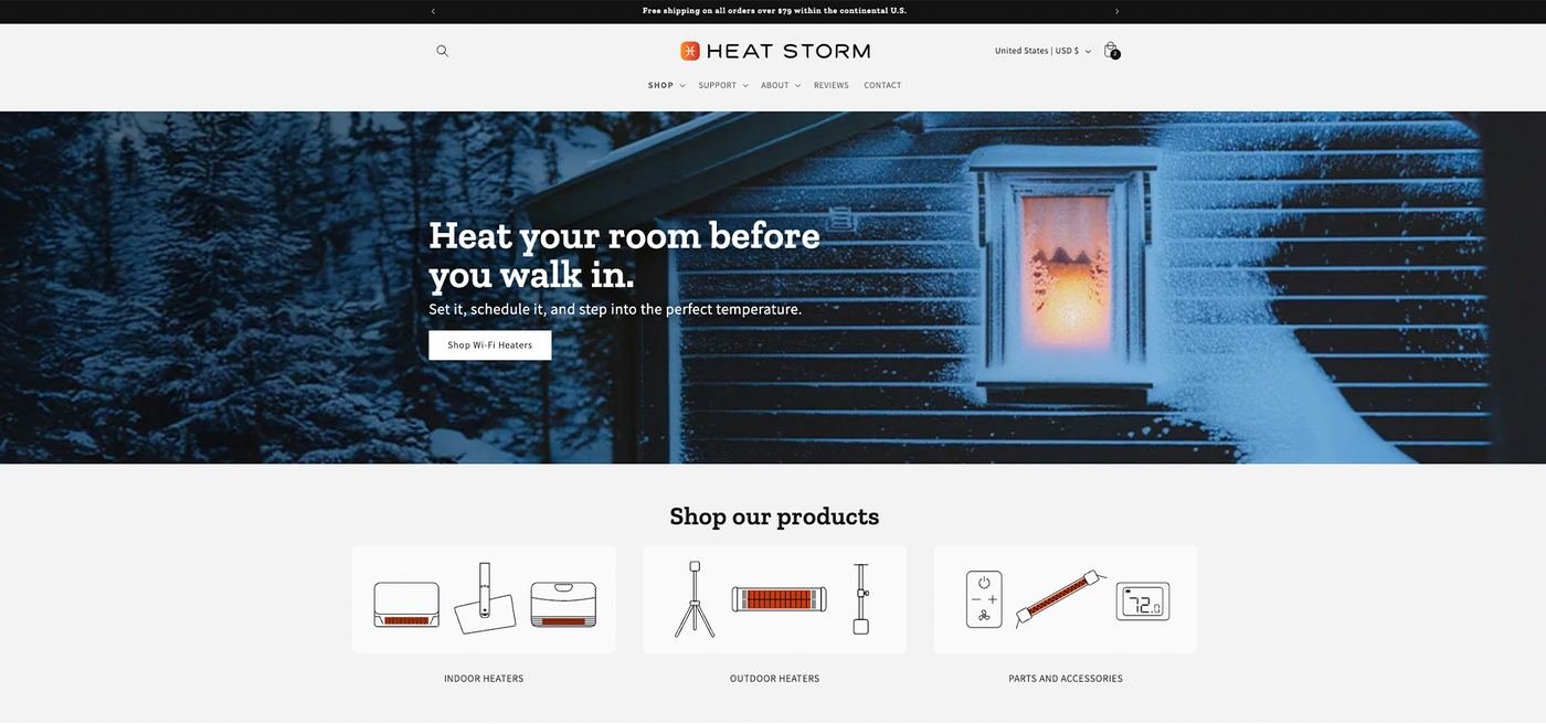

Shoppers cross-shop the category on Amazon before they ever land on the brand's own site.
A conversion-first storefront that gets out of the way, with clear product logic and fast paths from category to cart.
A site built to win the moment a cross-shopping visitor decides where to actually buy.
Ember accent to create a clear path from discovery to purchase.
Reworked product hierarchy brought price, benefits, and best-selling models forward, helping customers compare options and decide faster.
Specs, reviews, warranties, and other confidence-building details were placed at key decision points to reduce hesitation and support conversion.
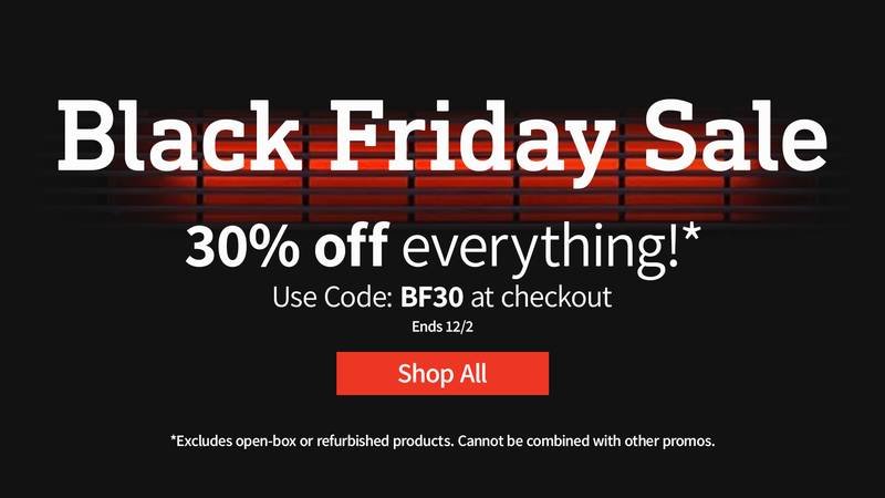
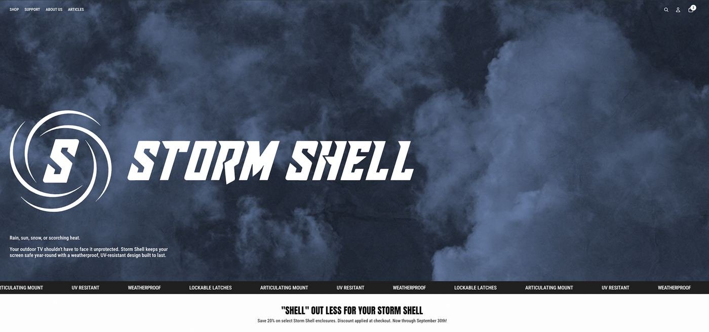

A premium product has to justify its price against cheaper outdoor TV covers.
A bolder, more technical identity. Type and imagery that read engineered, not generic patio gear.
A storefront that sells the 3-year warranty and build quality as the headline, not a footnote.
High-contrast dark theme borrowed from apparel branding, not typical outdoor-DTC cues.
Warranty and durability claims placed above the fold.
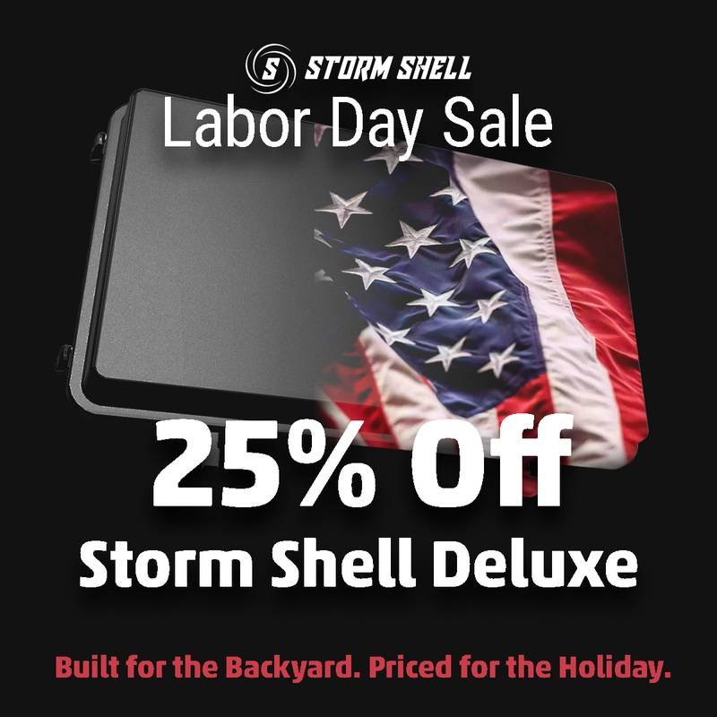
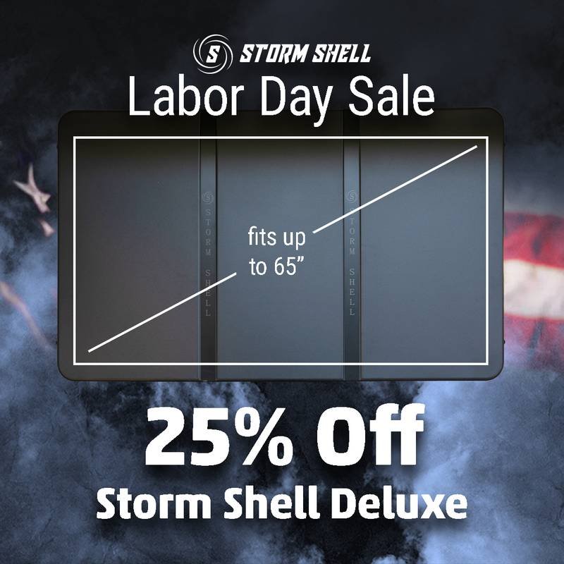
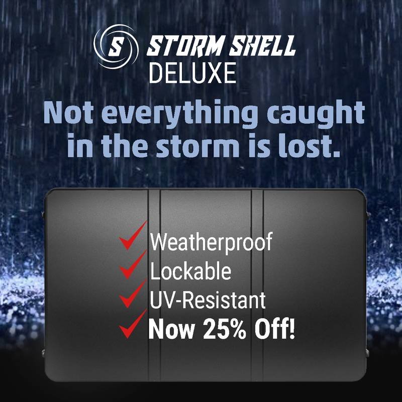
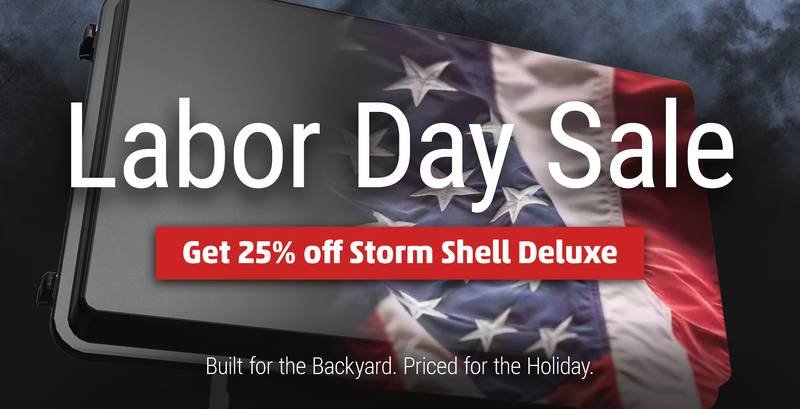
A seasonal promo system built to swap in fast for holiday sales.
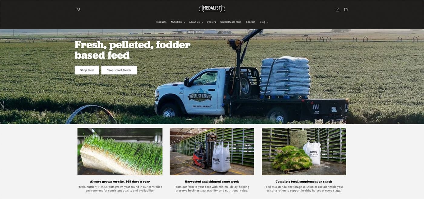

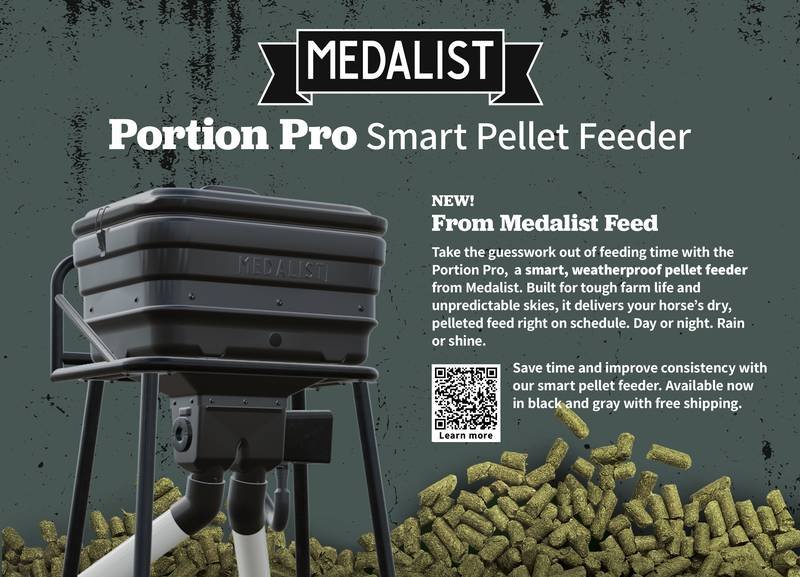
A niche feed brand has little ad budget to out-shout large agricultural suppliers.
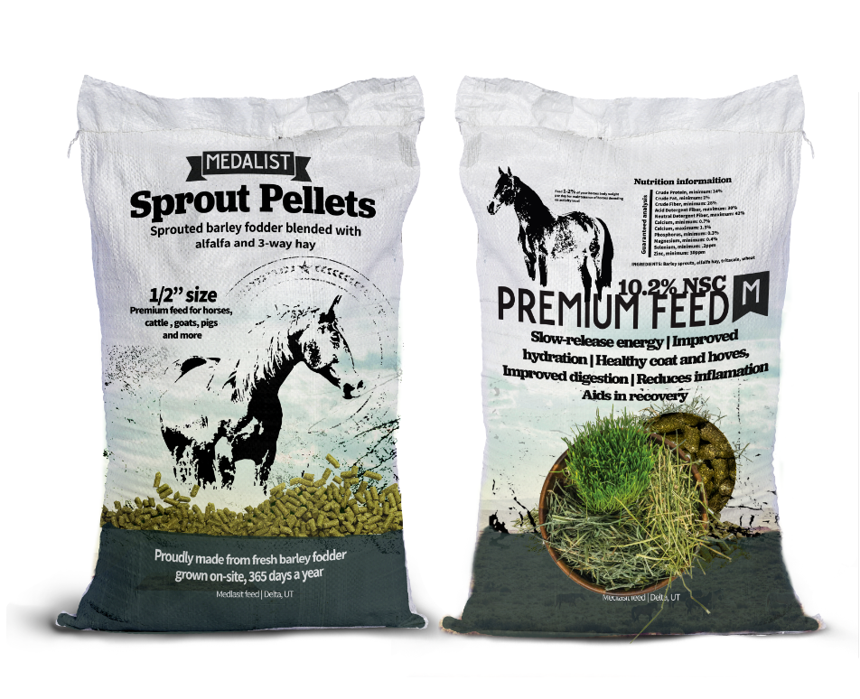
Brand voice and photography built around the real farm and real customers, not stock imagery.
A small, loyal customer base that reorders because the brand feels built by people who actually feed horses.
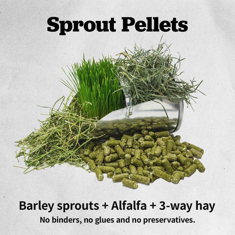
Real customer and farm photography in place of stock imagery.
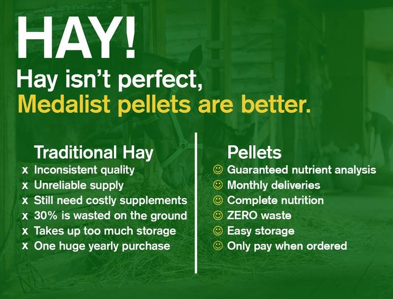
A flyer and print system that doubles as in-store and direct-mail material.
Products organized by use-case first, SKU second.
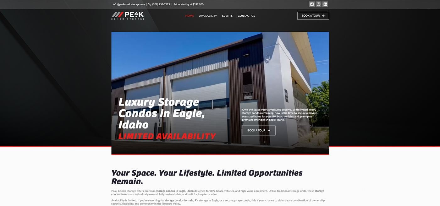

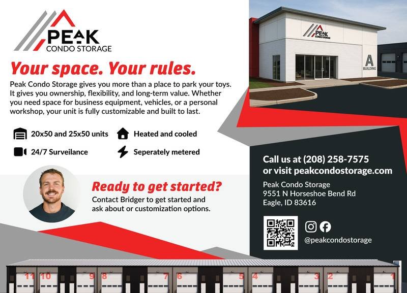
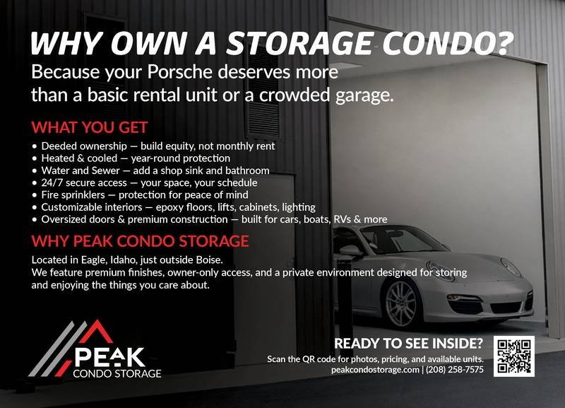
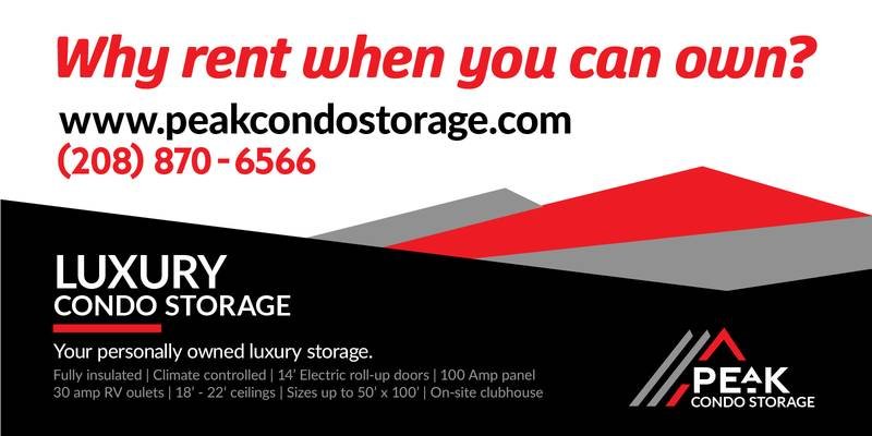
A high-consideration purchase needs to earn trust before a phone call, not just a click.
A slower, more deliberate structure — a clear price anchor, real facility photography, one path to reserve.
A B2B-adjacent lead-gen site that reads like a real-estate listing, not a storage-unit ad.
Real facility photography in place of stock storage-unit imagery.
Price anchor placed in the header, not hidden three clicks deep.
A single reservation path with no competing calls-to-action.

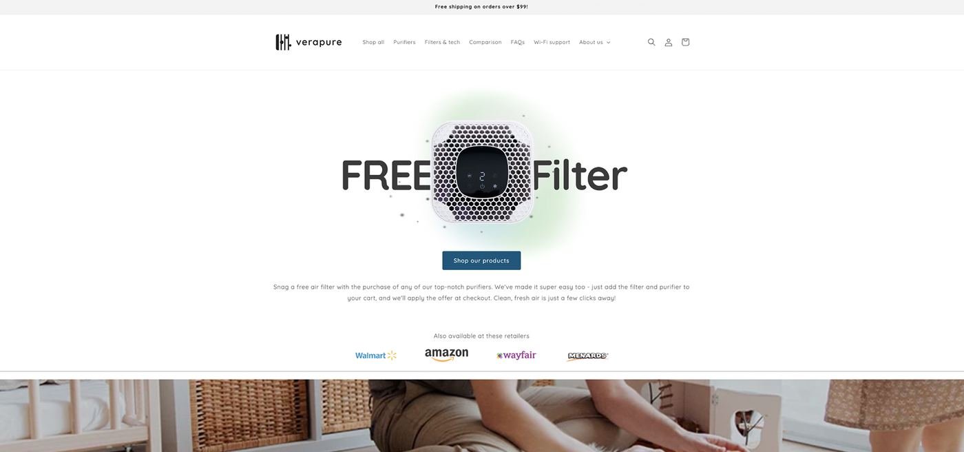

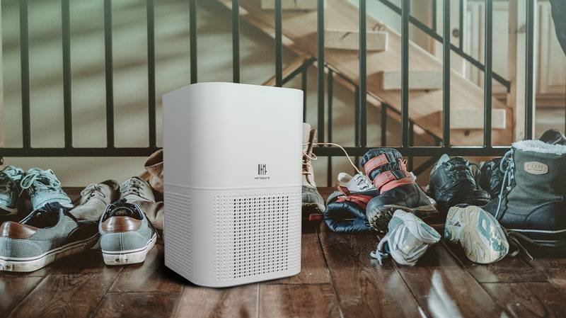
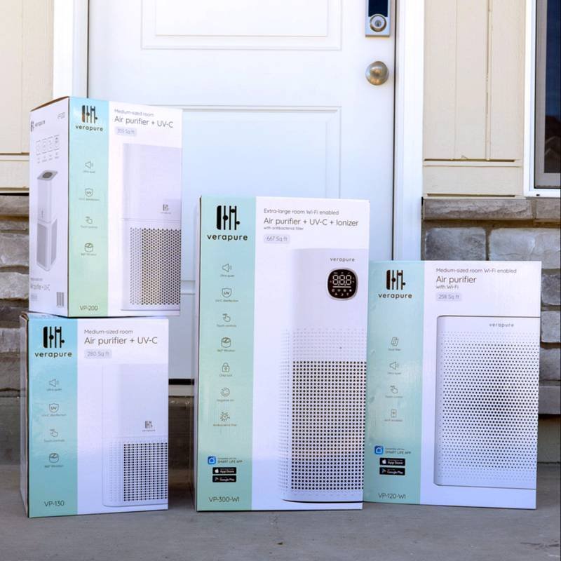
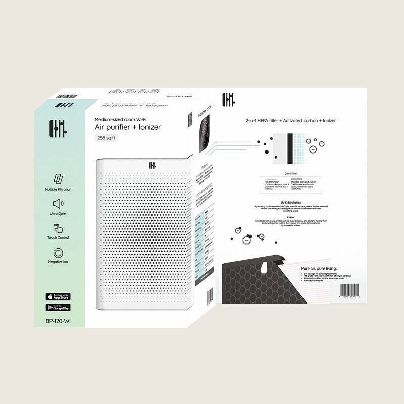
Launching from zero means identity, product story, and storefront all have to arrive at once, consistently.
A full ground-up build — name, mark, packaging language, storefront, and email designed together, not stitched from vendors.
A brand that can sit next to Walmart, Amazon, Wayfair, and Menards listings and still look like it belongs.
A retailer-agnostic identity system built to survive resizing onto a dozen marketplace listings.
Seasonal messaging layered onto an evergreen visual system.
Identity, storefront, and lifecycle email built under one hand, one voice.

Loan officers needed complex, constantly-changing lending criteria and disaster-response information navigable without a developer in the loop.
A full information-architecture system built inside SharePoint — a JSON-driven lending-guide tool, a templated bulletin system, and a complete icon set, designed and built by hand.
Non-technical teams could self-serve complex lending and disaster-response information instantly, in one consistent system — not a patchwork of PDFs and emails.
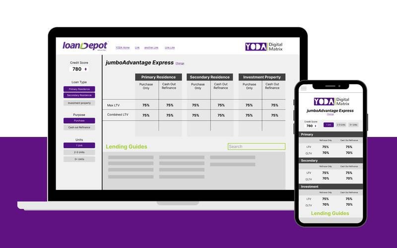 YODA Digital Matrix — lending-guide reference tool
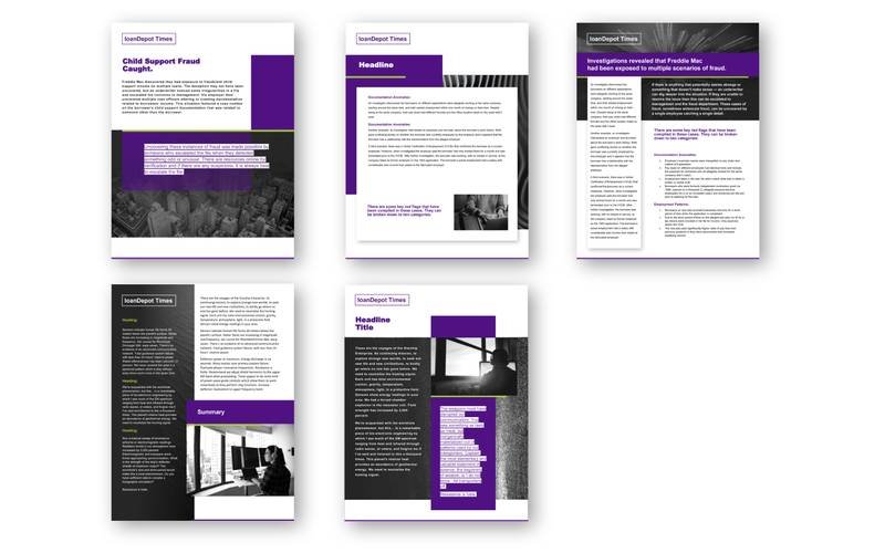 loanDepot Times — internal newsletter
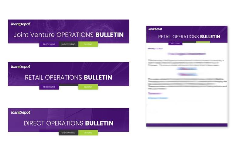 Operations Bulletins — templated document system
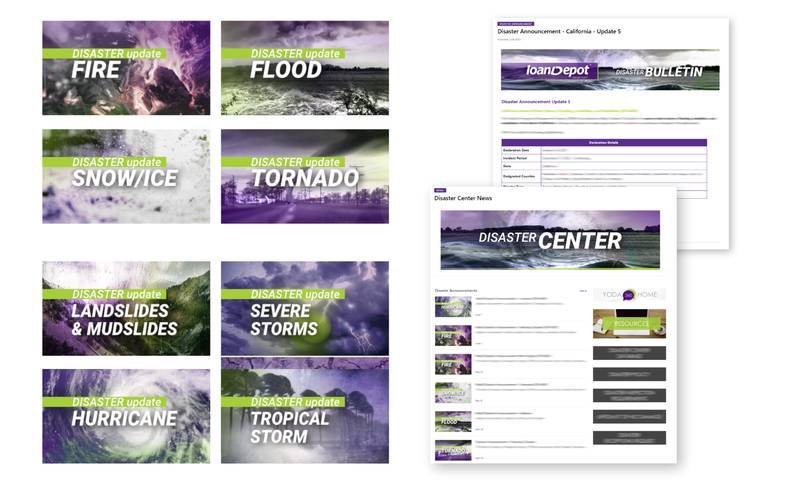 Disaster Center — full icon set & intranet page
Agency craft and one retired brand, included for range — not the main pitch, but proof of depth behind it.
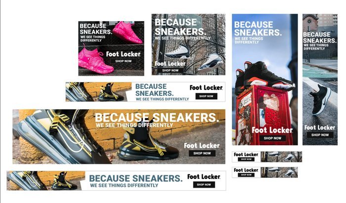
Five hand-built interactive and display campaigns for major retail brands, built inside Rakuten's ad-serving frameworks — flip-panel comparisons, product-feed sliders, image-sequence demos, dynamic retargeting, and multi-format banners.
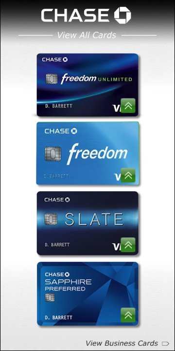
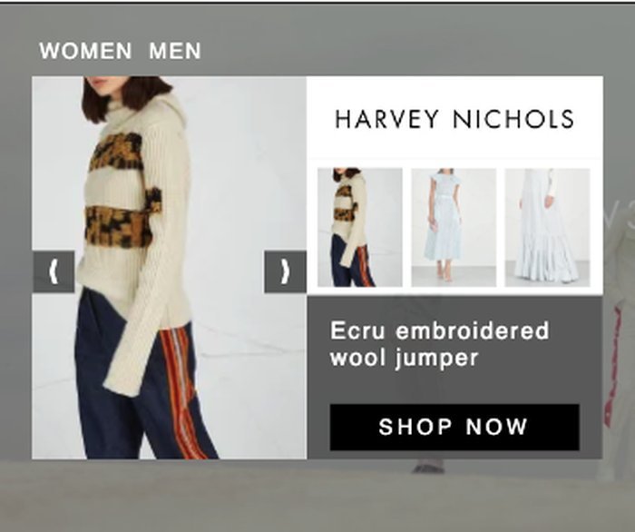



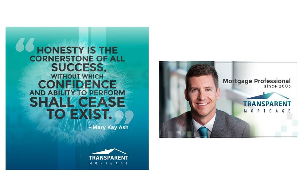
Social and display graphics for an independent mortgage professional, pairing brand identity with a personal, trust-driven tone.
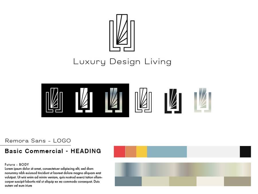
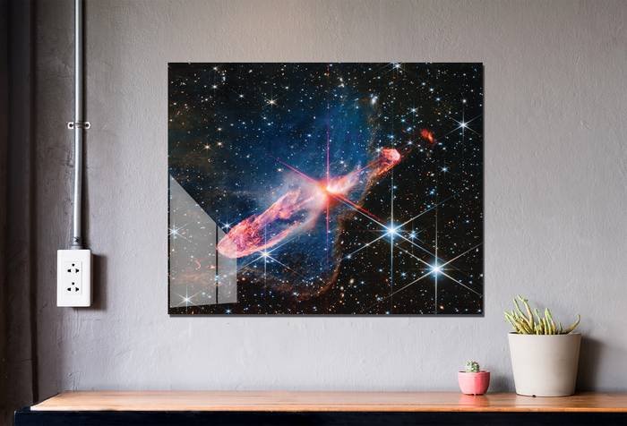
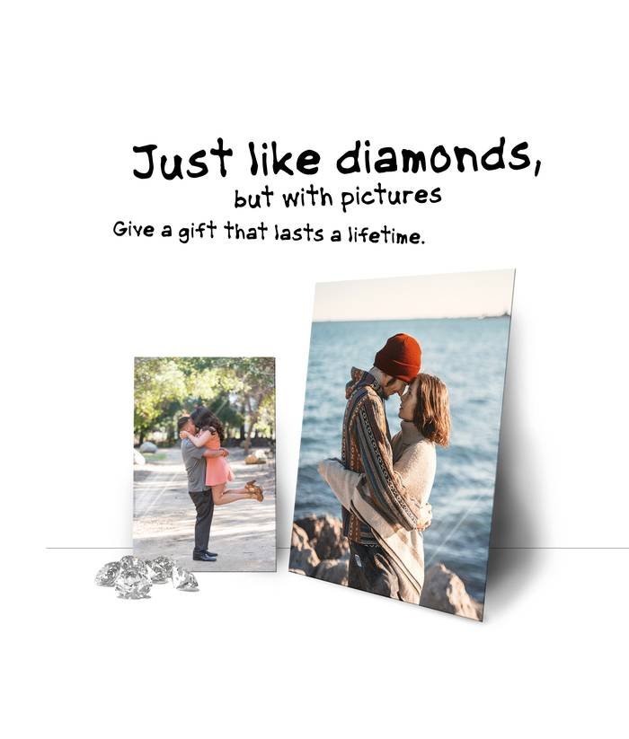
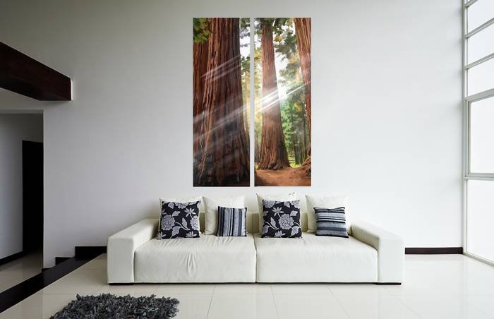
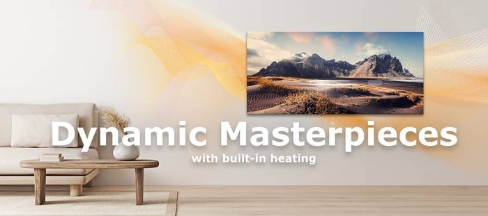
A second full brand built from zero at EnergyWise: name, identity system, brand guide, and a Shopify storefront selling large-format wall art and decor. Retired in 2025 as EnergyWise consolidated its brand portfolio.

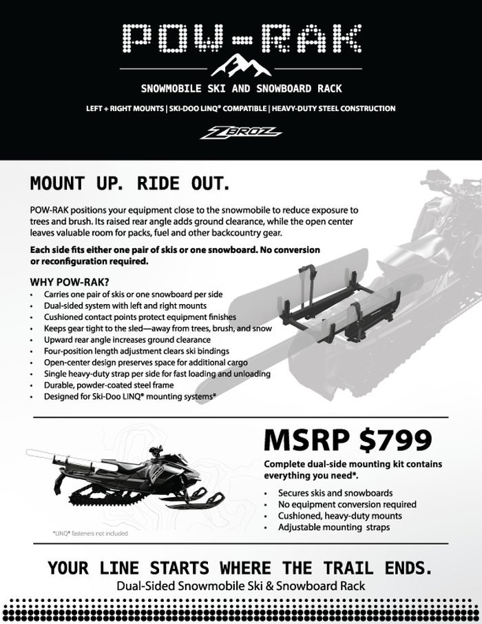
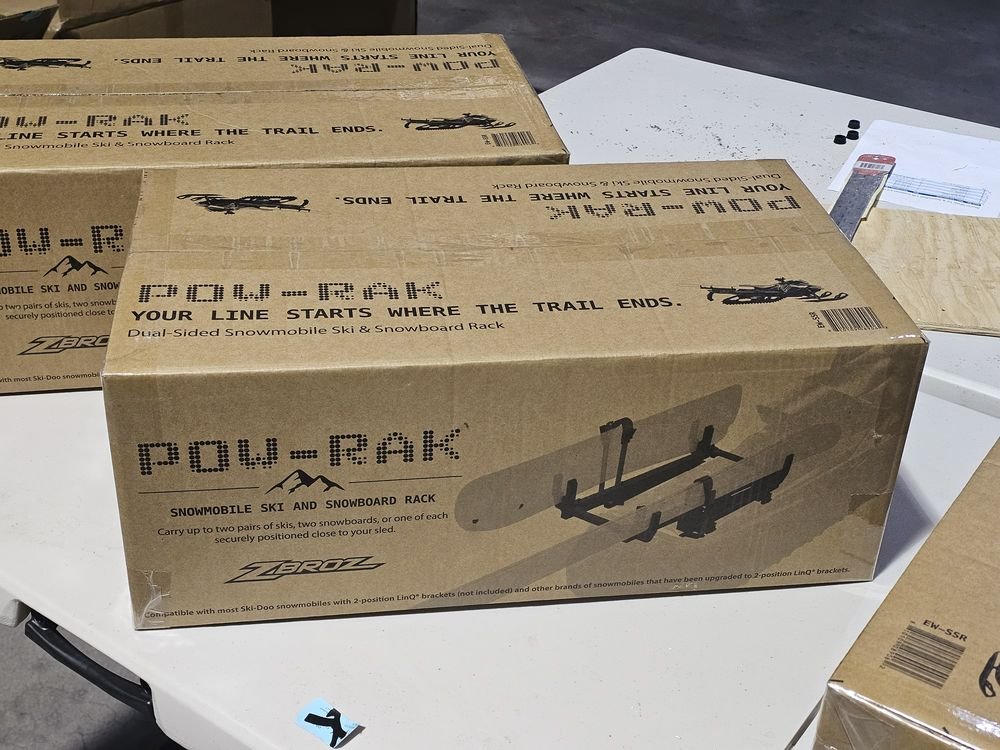
A new motorsport accessory product built in partnership with Zbros. Site scope — platform, sales channels, payment handling — currently being defined.
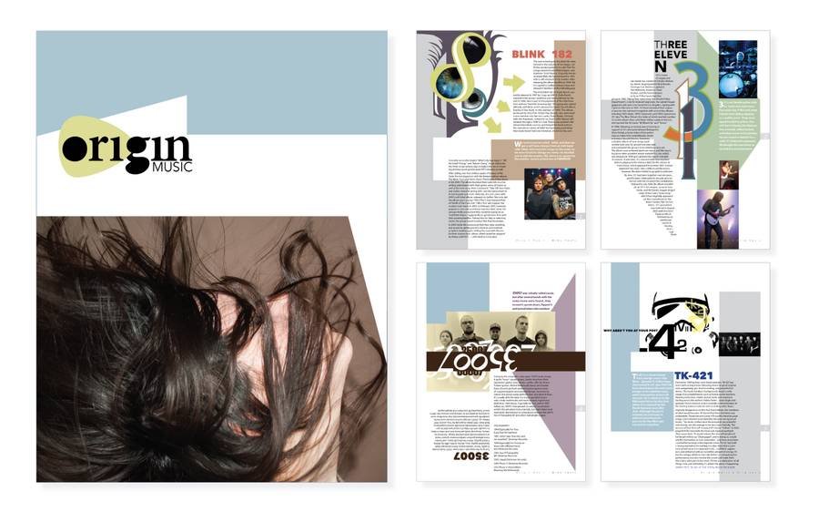
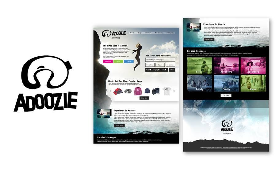
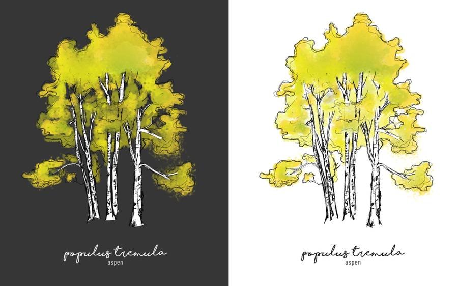
A few personal and concept pieces outside client work — editorial layout, illustration, and one concept brand.
The part of this work I care most about is sitting with another designer and pushing a piece until it's right — one-on-one or in a small group. I also take on a limited number of freelance and brand-identity projects outside my day-to-day role.